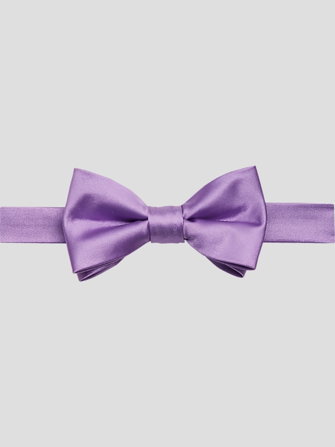
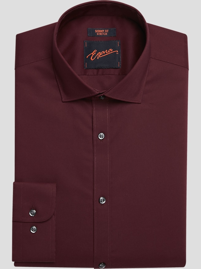
A red and black wedding theme pairs the depth of black with the warmth and intensity of red, creating a look that can feel romantic, architectural, vintage-inspired, or distinctly dramatic. In wedding attire, black provides a grounded foundation while red establishes the focal point, whether that color appears at the neckline, in a pocket square, or as a subtle woven detail. The effect depends as much on proportion as on shade. A black suit with a deep crimson accent feels restrained and polished; a larger area of red creates a more expressive look that may suit a groom or a wedding party with a theatrical aesthetic. Burgundy and oxblood bring a dark, nuanced quality to the palette, while scarlet and cherry red create sharper contrast. These shades are not interchangeable, especially when several people stand together for photographs. Consistent undertones help coordinated attire look deliberate without requiring every detail to match exactly. The setting also influences how the palette reads: black tailoring and rich red accents can echo velvet furnishings in a historic ballroom, complement red roses against dark table linens, or introduce color into a clean, contemporary venue. Clothing remains most convincing when it reflects the celebration without resembling the décor too literally. A small red accent can connect a guest’s outfit to the theme while leaving the strongest color statement to the couple and wedding party. Dress code remains the deciding factor in the level of formality. A black suit offers versatility for many weddings, while a tuxedo belongs to a more formal setting, with a black bow tie preserving a traditional black-tie presentation. The distinction comes from details such as lapel finish, shirt styling, and coordinated accessories rather than color alone. Across those settings, red and black wedding attire works best when the silhouette is clean, the color balance is intentional, and the person wearing it feels comfortable from the ceremony through the final photograph.
Fabric and construction give this palette its character up close. Black wool suiting can provide a smooth, refined surface and a natural drape, while a textured weave adds depth without introducing another color. Wool blends vary in feel and performance, so fabric composition, lining, and construction matter more than a broad label alone. A matte black cloth tends to create a quieter backdrop for red, whereas satin accents introduce reflected light and a more formal contrast. Richly textured accessories, including woven silk or jacquard, can make a deep red shade feel dimensional rather than flat. Velvet brings a plush surface that changes appearance as its pile catches the light, making it especially expressive in a dramatic wedding setting. Combining several glossy or heavily textured finishes can compete with the strong palette; a more balanced outfit lets one surface draw attention while the others support it. Fit is equally important because dark tailoring makes the outline of the outfit especially noticeable. A jacket should sit cleanly at the shoulders, close without pulling across the front, and allow comfortable movement when reaching forward or offering an embrace. Trousers need enough room through the seat and thigh for sitting through a ceremony and moving across a dance floor, with a hem that falls neatly over the shoes. Shirt collars should feel secure without constricting, and sleeves should work with the jacket rather than bunch beneath it. These practical details affect both appearance and wearability over a long celebration. Care also helps preserve the contrast that makes red and black so effective. Following each garment’s care label is essential, particularly for structured tailoring, delicate linings, and richly dyed accessories. Airing garments after wear, using supportive hangers, and addressing marks promptly according to fabric guidance can reduce unnecessary cleaning. A garment brush may help remove surface dust from suitable fabrics, while pressing or steaming should always respect the material and construction. Proper storage away from direct light helps protect dark shades and keeps formal clothing ready for another occasion.
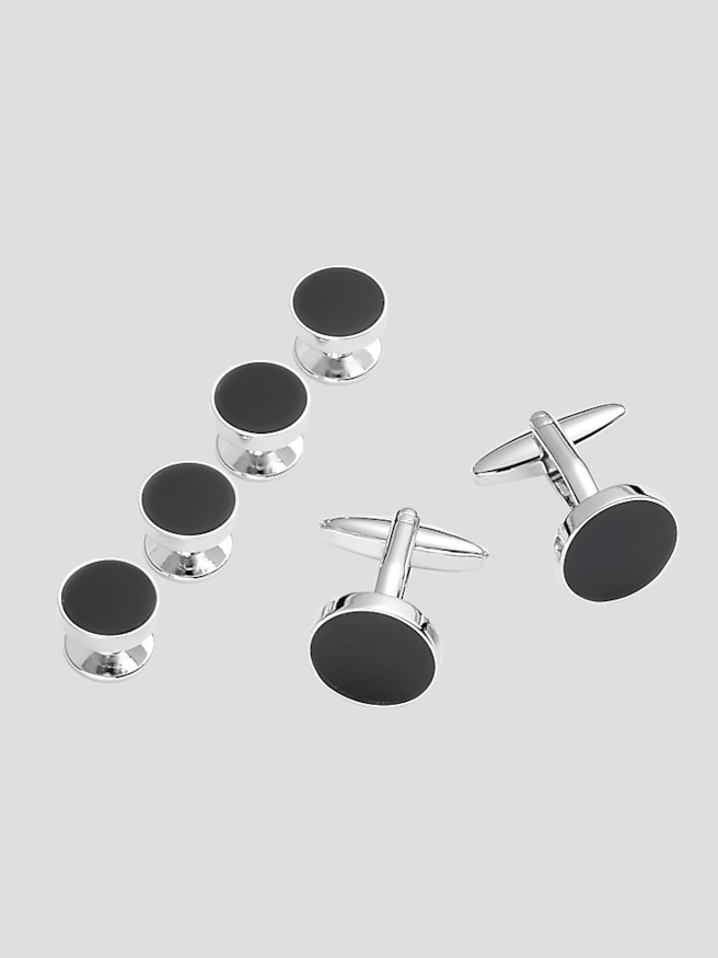
For a coordinated wedding party, consistency in the large details usually matters more than identical styling from head to toe. A shared black foundation, a defined red color family, and a similar level of formality create a recognizable connection even when individual fits differ. That flexibility is useful across a group with varied proportions and comfort preferences: one person may need more room through the shoulders, while another benefits from a closer waist or an adjusted trouser length. A cohesive photograph does not require everyone to wear the same cut. The groom can stand apart through a distinct texture, a slightly deeper red accent, or a different treatment at the neckline while remaining connected to the group. If red flowers are part of the celebration, coordinating the general undertone is often more natural than trying to reproduce the exact shade of every petal. A crimson accent beside a red rose can look harmonious even when the materials reflect light differently. Viewing fabrics together under the venue’s lighting, when practical, helps reveal whether a red appears brighter, darker, or more purple than expected. Black also provides room for restrained metallic details: silver contributes a cool, crisp finish, while warmer metal tones change the mood without altering the central palette. For a related approach that places metallic contrast at the center, a Black And Silver Wedding Theme offers another way to frame dark formal attire. Red and black, however, has a distinctive emotional warmth that suits celebrations built around rich florals, intimate lighting, or bold graphic details. Beyond the wedding, well-fitting black tailoring can serve other formal occasions, and a measured red accent can be restyled without tying the entire outfit to one event. Durable construction, manageable care requirements, and a comfortable fit make the clothing useful beyond a single set of photographs. The lasting appeal is the balance: black supplies structure and composure, while red gives the ensemble its unmistakable point of expression.