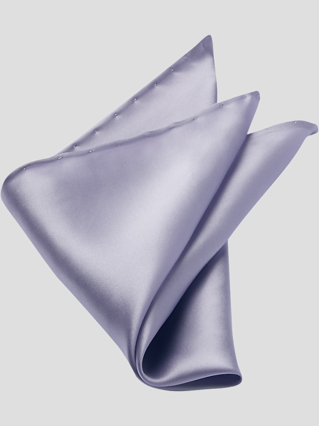
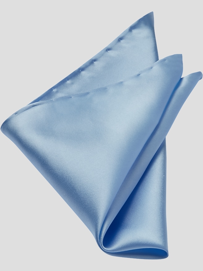
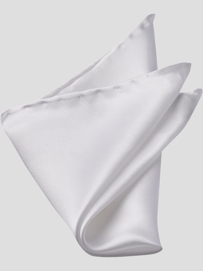
Light blue pocket squares bring a gentle note of color to tailored clothing without competing with the suit itself. Against a navy jacket, the shade creates a clear contrast that draws attention to the chest pocket; against charcoal or medium gray, it softens the overall look while keeping the outfit composed. Tan and brown jackets offer another useful pairing, especially when their fabric has visible texture. The appeal is in the balance: light blue has enough presence to make a pocket square feel intentional, but it is understated enough for business occasions, wedding celebrations, graduation ceremonies, and dinners that call for a jacket. A white shirt gives the color a clean backdrop, while a pale blue shirt can establish a quieter connection between the pocket and the rest of the outfit. The shades do not need to match exactly. A slightly lighter square against a blue shirt often creates more depth than repeating the same tone throughout. Ties offer another point of connection, whether through a small blue detail in a pattern or through a complementary shade such as burgundy, navy, or brown. A pocket square and tie generally look more individual when they relate to each other rather than repeat the same fabric and pattern. For a wedding guest wearing a dark suit, a light blue accent can add personality without making the outfit feel busy. For a groom or members of a wedding party, it can echo the celebration’s color palette while leaving room for differences in ties and jacket styles. Worn without a tie, it gives a sport coat a considered finishing touch, particularly when the shirt and trousers are otherwise simple. Dress codes still matter, and occasions with specific formal requirements may call for a traditional white pocket square instead. Within settings that allow color, light blue offers a restrained way to make a familiar jacket feel more personal.
Fabric influences both the appearance of a light blue pocket square and the way it sits in the pocket. Silk often brings a smooth surface, a fluid drape, and a degree of sheen that can make the color appear brighter as it catches the light. That character works well when the rest of the outfit has a clean, tailored finish. Linen typically has a more visible weave and a crisp feel, giving pale blue a textured appearance that pairs naturally with jackets whose fabric also has some character. Cotton can offer a softer, less lustrous effect, while blended fabrics vary according to their fiber content and construction. These differences matter as much as color when choosing an accessory for a particular outfit. A glossy square against a textured jacket creates contrast; a matte square with a smooth suit can keep the finishing details quiet. Solid colors emphasize the fabric and the fold, while small patterns introduce detail without necessarily dominating the outfit. A narrow border can frame the visible edge, and a pattern with blue accents can connect to a shirt or tie without creating an exact match. Size and fabric weight also affect the result. Pocket squares do not have a body fit in the way a shirt does, but they still need to work with the dimensions of the jacket’s breast pocket. A larger or thicker square can create unwanted bulk in a shallow pocket, while a very small, slippery square may settle below the opening. The best proportion leaves the pocket lying comfortably against the chest with enough fabric visible to show the intended shape. A straight fold creates a narrow, orderly band of color; a soft puff emphasizes drape and looks less structured. Crisp fabrics tend to support defined edges, while fluid fabrics lend themselves to rounded shapes. Neatly finished edges, an even weave, and secure stitching contribute to durability, particularly when the square is folded and adjusted repeatedly. The finishing detail should complement the jacket, not stretch the pocket or distract from its lines.
Keeping light blue pocket squares looking fresh starts with care suited to the fabric rather than a single cleaning method for every square. The care label should determine whether washing, professional cleaning, or another treatment is appropriate. Pale fabrics can make small marks noticeable, so handling a square with clean, dry hands helps preserve its appearance, especially after using grooming products. Fragrance should go on before dressing rather than directly onto the fabric, and a decorative pocket square is best kept separate from a handkerchief used for practical purposes. After wearing, unfolding the square and storing it clean and dry helps prevent a tightly compressed shape from becoming its usual resting state. Some fabrics respond well to careful pressing, but heat tolerance varies, and any ironing should follow the care instructions. A low-profile storage space that avoids crowding makes it easier to see colors and patterns while protecting finished edges from snags. These small habits matter for an accessory that may accompany the same suit to several occasions. Light blue also fits naturally into a collection of Stylish Pocket Squares, offering an alternative to white without requiring a dramatic change in the rest of the wardrobe. It can be a thoughtful gift for someone who regularly wears suits, enjoys dressing for special occasions, or is building a collection of tailored accessories. Because there is no collar, waist, or sleeve measurement to determine, the choice can focus on the recipient’s taste, usual jacket colors, and preference for subtle or expressive details. A smooth solid square may suit someone who favors simple combinations, while a restrained pattern may appeal to someone who already enjoys mixing textures. For a graduation gift or a wedding-party keepsake, the color can connect to the occasion while remaining useful afterward. Its lasting value comes from that flexibility: a small piece of fabric that adds distinction to a familiar outfit, with enough restraint to be worn again in a different setting.