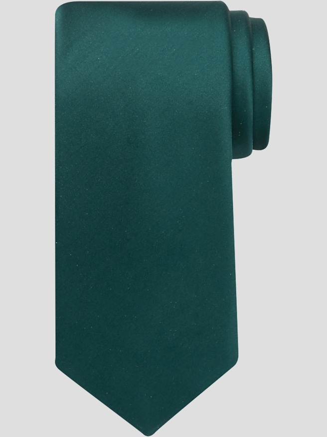
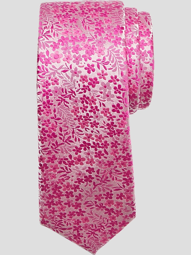
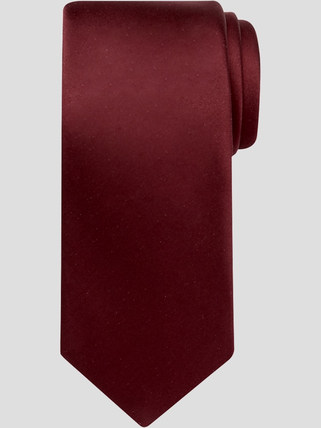
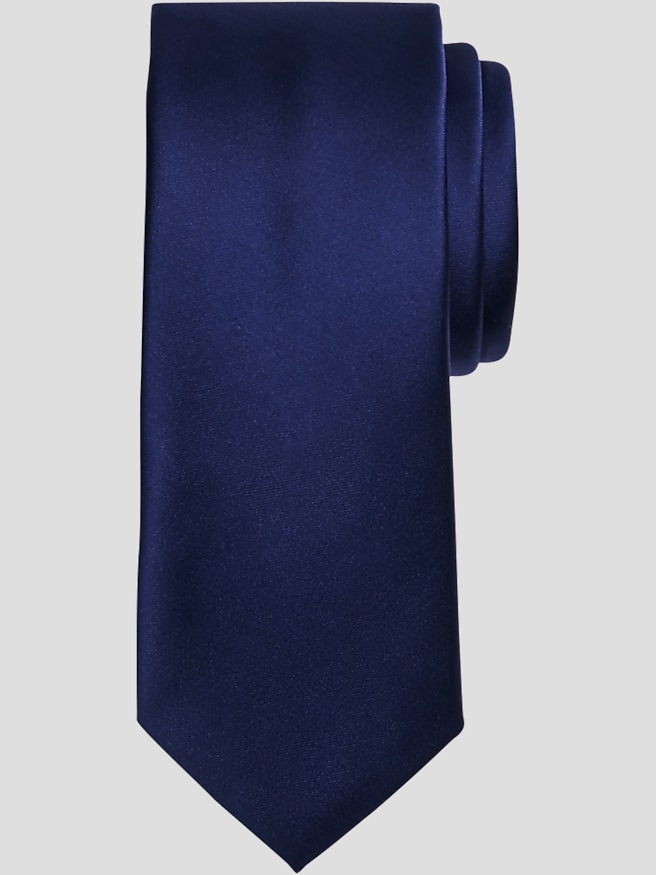
Tonal ties feature patterns in closely related shades of a single color, creating depth without the sharp contrast of a multicolor design. A navy paisley against a slightly lighter blue ground, for example, can look almost solid from across a conference table, then reveal its curved detail up close. That balance gives tone-on-tone neckwear its appeal: enough character to make an outfit feel considered, with enough restraint for a business meeting, wedding ceremony, or evening reception. Tonal stripes, small geometric repeats, dots, and floral motifs each bring a distinct rhythm to the fabric while keeping the overall color story cohesive. Some patterns rely on differences in shade; others become visible through the way smooth and textured areas reflect light. A woven jacquard can combine both effects, giving a tie a dimensional surface that changes subtly as the wearer moves. Unlike a plain solid tie, a tonal design has a pattern to discover, but it does not need a bold color contrast to make that pattern interesting. This makes it especially useful alongside clothing that already has visual detail, such as a fine-striped shirt or a checked suit. Navy, charcoal, burgundy, and silver-gray tones lend themselves to understated combinations, while deeper green or muted purple can introduce color without making the tie the loudest part of the outfit. The result depends as much on the relationship between the tie, shirt, and jacket as on the tie itself. A darker blue tie against a pale blue shirt creates clear separation while staying within one color family. Against a white shirt, that same tie becomes a more defined focal point. Tonal ties suit anyone who prefers polished neckwear with quiet detail, including professionals building a dependable work wardrobe, wedding guests dressing for a specified dress code, and graduates choosing an accessory for interviews or milestone celebrations.
Material and construction influence how a tonal tie looks, feels, knots, and holds up to repeated wear. Silk is valued for its drape and natural luster, which can make subtle woven motifs especially noticeable under light. A silk jacquard builds the pattern into the weave rather than relying solely on a printed surface, although tone-on-tone effects can be achieved through either weaving or printing. Finely textured fabrics often have a softer visual finish than smooth, reflective ones, so two ties in nearly the same shade can create quite different impressions. Wool and wool-blend neckwear generally brings a more matte, tactile quality, while polyester and other blended fabrics vary in sheen, softness, and care requirements. Fiber content alone does not determine durability; the weave, stitching, lining, and handling all contribute. A neatly finished tie with a balanced lining should drape cleanly and form a knot without excessive bulk. Width is another practical consideration. A tie usually looks most proportional when its width relates to the jacket lapels and the wearer’s frame, rather than being selected in isolation. Length matters just as much: after knotting, the front tip generally reaches near the waistband or belt buckle. Taller wearers, larger neck sizes, and fuller knots may require additional length to achieve that placement. A compact four-in-hand knot works well with many standard collars and can preserve more usable length, while a half-Windsor creates a fuller, more symmetrical shape when the fabric and collar opening allow it. Thick fabric builds volume quickly, so a large knot is not always the best match for a substantial weave. A small dimple beneath the knot adds shape and lets light play across the tonal pattern. For someone who wears a tie through presentations, client lunches, and an evening event, these proportions affect both comfort and appearance. The tie should sit comfortably beneath the collar, with the narrow end secured behind the front blade rather than swinging into view.
The understated pattern of tonal neckwear leaves room for thoughtful coordination without requiring every accessory to match. A charcoal suit, crisp white shirt, and burgundy tonal tie create a clear, restrained combination for an important presentation; a navy suit with a pale blue shirt and deeper blue patterned tie feels cohesive without looking flat. When the shirt has stripes or the jacket has checks, a smaller, quieter tie motif can keep the combination from feeling crowded, especially when the patterns differ in scale. A pocket square can pick up a supporting shade or introduce a simple white accent instead of repeating the tie’s exact fabric. For weddings, tonal ties can help attendants coordinate within a chosen color palette while retaining the depth that distinguishes patterned fabric from a flat block of color. Dress-code requirements still take priority: a necktie is appropriate for many suited occasions, but it is not a substitute for the bow tie traditionally associated with black-tie attire. Beyond everyday and occasion dressing, Seasonal Ties offer another direction for a neckwear wardrobe with more themed variety. A tonal tie also makes a thoughtful gift for someone starting a new role, celebrating a promotion, or wearing a suit more often. Familiar shirt and suit colors are useful clues to a shade the recipient will actually wear, and preferred tie width and length make the choice more personal. With regular use, careful handling helps preserve both the fabric and the shape. Untying the knot gently after wear, rather than pulling the narrow end through a tightened knot, reduces unnecessary strain. Hanging a tie on a smooth rack or loosely rolling it for storage helps limit creasing; leaving it knotted can set folds into the fabric. Care labels should guide cleaning, since silk, wool, and blended materials do not all respond well to the same treatment. Blotting a spill promptly without rubbing can help avoid spreading it, while delicate fabrics may need professional attention. Thoughtful care keeps the quiet pattern, clean drape, and well-shaped knot central to the tie’s appeal.