Purple and white wedding colors create a polished setting that can feel airy and romantic, richly dramatic, or crisp and modern depending on the shades and materials selected. Soft lavender paired with bright white brings a gentle, garden-inspired character to a daytime ceremony, while lilac, orchid, and ivory can create a fresh look with a little more energy. Deeper tones such as plum, eggplant, and aubergine lend warmth and sophistication to evening celebrations, especially when balanced with clean white details. The beauty of this palette is its range: pale purple can make a room feel light and open, while saturated purple adds depth to photographs and gives formal attire a memorable finish. Couples planning a cooler-weather celebration may prefer richer purple accents with ivory rather than stark white, creating a welcoming atmosphere that works beautifully in a ballroom, historic venue, or candlelit reception space. Those drawn to a darker, more dramatic palette can find additional inspiration in Dark Purple Wedding Colors. When comparing options for a purple and white wedding, consider the venue’s existing colors, the time of day, the amount of natural light, and how each shade will appear beside skin tones and photography backgrounds. A color that looks delicate on a screen may appear nearly white in bright outdoor light, while a rich plum can look especially deep under evening lighting. Ordering early enough to review colors in person, checking fabric descriptions, and coordinating all members of the wedding party with the same shade family can help create a thoughtful, consistent appearance without making every detail look identical.
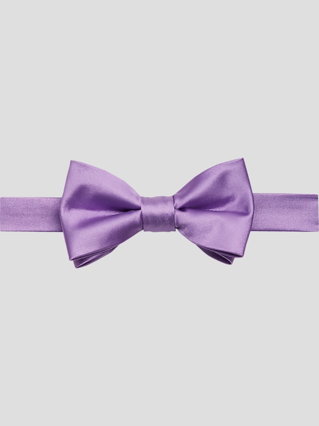
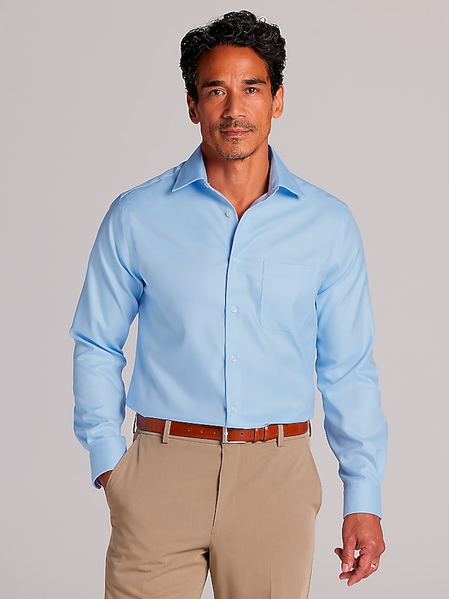
Attire is often the clearest way to bring purple and white wedding colors into the celebration while keeping the overall look refined. A classic black, charcoal, or navy suit can serve as a dependable foundation, allowing purple neckwear, pocket accents, dress socks, or other small details to carry the palette. For a softer presentation, gray tailoring with lavender or lilac accents creates an understated combination suited to daytime ceremonies and outdoor settings. White shirts provide a clean visual bridge between the two colors, particularly when paired with a purple tie or coordinating accessory, while ivory can add warmth when the wedding design includes cream linens, golden lighting, or vintage-inspired details. Members of the wedding party do not need to match from head to toe; using one shared accent color while varying suit shades or textures can give the group a natural, collected appearance. Fit deserves equal attention to color. Shoulder seams should sit neatly, sleeves should allow a small amount of shirt cuff to show, and trousers should fall cleanly over the shoes without excessive bunching. For formal celebrations, a tuxedo-inspired silhouette can sharpen the look, while a well-fitted suit may feel more relaxed for a vineyard, garden, or family-centered reception. Coordinating attire for grooms, groomsmen, fathers, ushers, and other honored guests also makes thoughtful gifting easier. A purple accessory or polished formalwear addition can be a meaningful present for someone participating in the ceremony, especially when it reflects the couple’s chosen palette and remains useful for future celebrations, dinners, and formal gatherings. During the cooler months, layering with a tailored jacket, textured fabric, or deeper accent shade can add visual richness and practical comfort without losing the elegance of the color scheme.
The surrounding details can make purple and white wedding colors feel cohesive from the ceremony aisle through the reception table. White florals with lavender stems create a soft, garden-like effect, while white blooms paired with deep purple flowers offer stronger contrast and a more formal mood. Greenery can keep the palette grounded, and subtle silver or gold touches can influence the character of the celebration: silver emphasizes a cool, contemporary finish, while gold brings warmth and old-world richness. White table linens provide a calm foundation for purple centerpieces, place settings, printed materials, or glass accents, and small repeated details often have more impact than covering every surface in color. A purple pocket accent echoed in the floral arrangements, or lavender lettering repeated on the ceremony programs and reception menus, can make the design feel intentional. For photographs, contrast matters. White attire or white architectural details may stand out beautifully against deeper purple accents, while lavender and gray can create a soft, blended look in outdoor portraits. Think about how the palette will appear in both close-up images and wide views of the venue, and choose shades that remain recognizable under daylight, indoor lighting, and evening illumination. Guests may also appreciate guidance through the invitation design or wedding website, particularly when the celebration includes a requested dress level or a preferred range of purple tones. Whether the setting is an airy daytime gathering, a formal evening reception, or a warm celebration during the cooler months, carefully coordinated clothing and accessories help every participant feel prepared while allowing the couple’s personality to remain at the center of the day.