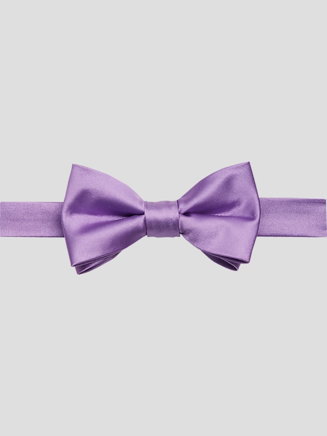
Purple and red wedding colors create a bold, romantic palette with enough depth for formal attire and enough range for a more relaxed celebration. Burgundy and plum produce a rich, closely blended effect, while crimson and royal purple offer a brighter, more pronounced contrast. Eggplant adds depth without drawing as much attention as a vivid violet, and a muted wine red can feel more understated than scarlet. In wedding attire, these colors often work best against a neutral foundation: charcoal brings out their depth, navy softens the contrast, and black gives the combination a distinctly formal finish. Ivory and white provide breathing room between saturated shades, while small gold or silver accents can connect the palette to jewelry and other finishing details. A groom might wear a plum accent against a charcoal suit, with burgundy appearing in a boutonniere or pocket square. Wedding party members can echo that balance without wearing identical combinations, creating a coordinated appearance that still leaves room for individual style. The result feels connected in group photographs without making every outfit look copied from the next. Purple and red also relate naturally to floral details, including deep red roses and purple calla lilies, so the clothing can complement the setting rather than compete with it. The most wearable combinations usually give one color the leading role and keep the other to a smaller detail. A burgundy tie with a subtle purple pattern, for example, reads differently from a large expanse of each color placed side by side. Lavender, blush, and dusty rose can soften the overall effect when they appear elsewhere in the celebration. Exact matching is not always necessary; a consistent level of brightness and depth often matters more. Fabric swatches viewed together in natural light help reveal whether a purple leans blue or red, an important distinction when coordinating attire across a wedding party.
Fabric and finish influence how purple and red appear just as much as the shade names do. Smooth silk can give a burgundy or plum accessory a gentle sheen, while a woven texture makes the same color look quieter and more dimensional. Matte finishes are useful when the surrounding décor is already elaborate, and a restrained touch of shine can add definition to an otherwise simple outfit. Wool suiting offers drape, shape retention, and a polished surface that works well with rich accent colors. Blended fabrics vary in feel and performance, so fiber content, lining, and construction all deserve attention alongside appearance. Cotton dress shirts provide a clean foundation, while a subtle fabric texture can keep a mostly neutral outfit from feeling flat. Pattern scale matters, too: a small geometric design or understated stripe can bring purple and red together without overwhelming the face or competing with a boutonniere. A solid shirt generally leaves more room for patterned accessories, while a patterned shirt benefits from quieter accents. Fit gives these details their finished appearance. Jacket shoulders should sit cleanly, lapels should lie flat, and the front should close without pulling into an obvious X-shaped crease. A comfortable trouser waist and a clean line through the seat and thigh allow for sitting through the ceremony, standing for photographs, and moving across a dance floor. Sleeve and trouser length affect the entire silhouette, even when the color coordination is thoughtfully chosen. A jacket that looks sharp standing still also needs to feel comfortable during a hug or while seated at dinner. Slim, tailored, and more relaxed cuts can all suit a purple and red wedding palette; the strongest choice follows the wearer's proportions rather than a single silhouette. Accessories benefit from that same sense of proportion. Tie width should look balanced with the jacket lapels, and a pocket square can pick up one accent color without repeating the tie exactly. These small distinctions give formal clothing a more personal, considered finish.
Wedding attire in this palette can serve the groom, attendants, close family members, and guests, although each role calls for a slightly different level of coordination. Wedding party clothing often follows an agreed color direction, while guests can acknowledge the theme through a restrained accent rather than reproducing the full look. The invitation's dress code remains the clearest starting point: a purple and red palette does not make a suit interchangeable with a tuxedo, and a highly formal occasion may call for subtler color placement. For a ceremony followed by dinner and dancing, comfort and secure finishing details matter alongside appearance. A properly adjusted collar, well-fitting shoes, and accessories that stay neatly in place help the wearer focus on the celebration. Beyond the wedding, neutral tailoring paired with removable burgundy or purple accents can transition to other formal gatherings, anniversary dinners, and dressed-up evenings. That flexibility makes fabric quality and careful maintenance worthwhile considerations. Clothing labels provide the most reliable care directions, especially for lined jackets, delicate weaves, and mixed-fiber fabrics. Suits benefit from supportive hangers and time to air after wear; ties and pocket squares need storage that avoids tight knots, sharp creases, or snagging. Silk accessories generally require particular care with moisture and stain treatment, while pressing methods should suit the fabric rather than rely on one heat setting for everything. Professional cleaning is appropriate when the care label calls for it, and prompt attention to a spill can help prevent lasting damage. Thoughtfully chosen accessories can also make meaningful gifts for attendants or someone marking a milestone, especially when the shade suits clothing already in their wardrobe. For a softer contrast, Purple And White Wedding Colors pairs the same purple tones with a lighter foundation. Purple and red, by comparison, emphasizes depth and contrast, with neutral tailoring and carefully placed accents keeping the finished look balanced.