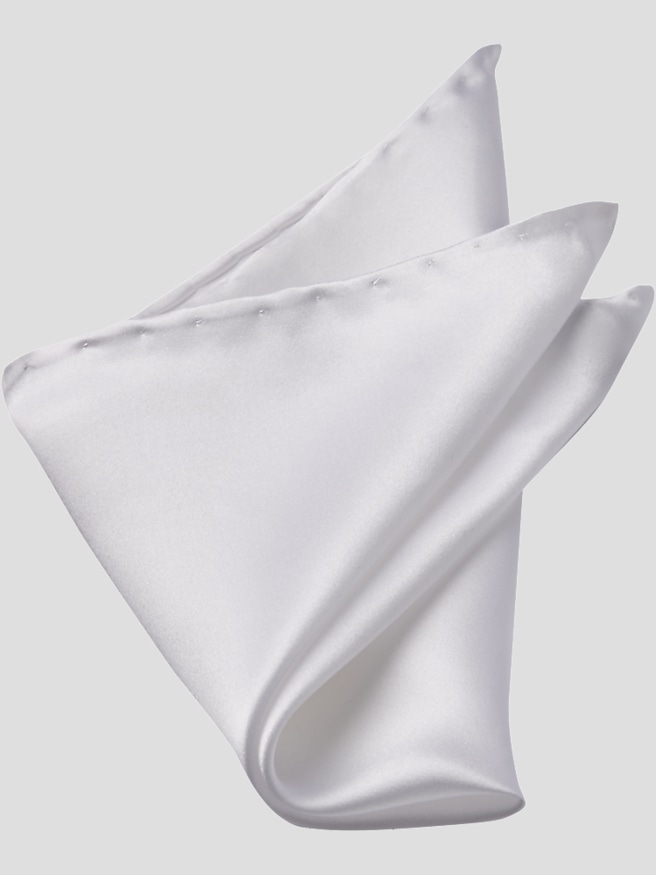
Checkered silk pocket squares add a measured touch of pattern to suits, blazers, and sport coats, bringing color and visual interest to the breast pocket without overwhelming the rest of an outfit. The appeal comes from the balance between an orderly check and silk’s naturally lustrous surface: straight lines create structure, while soft folds keep the effect from feeling rigid. Small checks can read almost like texture from a distance, making them an understated choice for business attire. Larger checks show more of their geometry and color, lending themselves to relaxed tailoring and occasions where a bolder accessory feels appropriate. The pattern may be woven into the fabric or printed onto its surface, and those methods can produce distinct effects. Woven designs can reveal subtle texture as the fabric catches the light; printed designs can offer sharply defined lines and detailed color combinations. Silk itself also varies in character. A smooth, fluid fabric tends to form rounded folds with an easy drape, while a crisper silk can hold a straighter edge and more defined points. Neither finish is automatically better; the right choice depends on the look and the shape of the jacket pocket. Fabric composition matters, too, since an all-silk square and a silk blend may differ in sheen, resilience, and folding behavior. Edge finishing adds another layer of detail. A finely stitched hem can look neat and unobtrusive, while a hand-rolled edge has a softly rounded appearance that may become part of the display. A square’s proportions also influence how much of the check remains visible after folding. A narrow strip highlights a line of color, while a fuller arrangement reveals more of the repeating pattern. These small differences help explain why two checkered silk pocket squares in similar colors can create noticeably distinct impressions when worn with the same jacket.
Color coordination is often most successful when a pocket square connects with an outfit rather than repeats it exactly. A blue-and-white check can echo a pale blue shirt against a navy jacket, while a check with muted red or gold can pick up a small accent in a tie. The colors do not need to match thread for thread; a shared undertone or one repeated shade usually provides enough continuity. With a charcoal suit and white shirt, a pocket square containing blue, burgundy, or cream can introduce depth without competing with the clean lines of the tailoring. Against a textured brown sport coat, a restrained check can add definition, especially when its background contrasts gently with the jacket. For a deeper red accent, Burgundy Silk Pocket Squares offer another direction for coordinating with navy, gray, and earth-toned tailoring. Pattern scale deserves as much attention as color. When a jacket already has a noticeable windowpane, a much smaller check in the pocket creates separation between the two patterns. A checked shirt, checked jacket, and checked pocket square of nearly identical scale can blur together, even when their colors work well individually. A solid shirt or tie gives a patterned square room to stand out, while a striped tie can complement checks when the spacing is clearly distinct. The intended setting helps determine the balance. For a client presentation, a low-contrast check shown in a slim fold adds personality while keeping the overall impression composed. At a wedding or anniversary dinner, a softer fold with a little more color can feel expressive without looking theatrical. A pocket square also suits an open-collar shirt and tailored jacket, where it provides a finishing detail in the absence of a tie. Its role is not to fill every visual gap, but to make the combination feel considered. Often, a modest amount of visible silk is enough to give familiar tailoring a more individual character.
The fit of a pocket square is really the relationship between its dimensions, the weight of the silk, and the depth of the breast pocket. A lightweight square may need enough fabric tucked inside to stay supported, while a heavier or larger square can create unwanted bulk in a shallow pocket. A comfortable fit leaves the jacket front lying smoothly, with the square resting securely rather than pulling the pocket open. The check itself can help establish a clean visible edge, although a perfectly aligned grid is not essential for a softer arrangement. A straight fold emphasizes order and works well with closely spaced checks; a relaxed puff shows more movement and can soften a strongly geometric design. A small adjustment after putting on the jacket often makes more difference than an elaborate fold prepared in advance. Long-term appearance depends on handling and care as well as fabric quality. Silk is strong for its weight, but rough surfaces, sharp objects, and repeated friction can snag fine threads or damage the hem. A decorative pocket square is best kept separate from keys and pens, and it serves a different purpose from a handkerchief intended for practical use. Care instructions should determine the cleaning method, because dyes, finishes, and construction can affect what the fabric tolerates. Rubbing a spot, applying an untested cleaner, or using excessive heat can leave a lasting mark. When pressing is permitted, a low setting and a protective cloth can help preserve the surface and edges. Storing the square clean, dry, and loosely folded helps prevent unnecessary stress on the fabric. As a gift, a checkered silk pocket square offers personality without requiring a jacket or shirt size. A palette drawn from the recipient’s usual tailoring makes the choice especially useful, whether the occasion is a graduation, a career milestone, or a wedding-party thank-you. With thoughtful coordination and appropriate care, it can become a familiar finishing touch across many occasions.