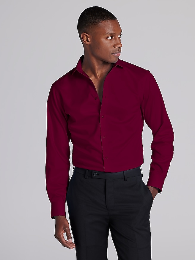
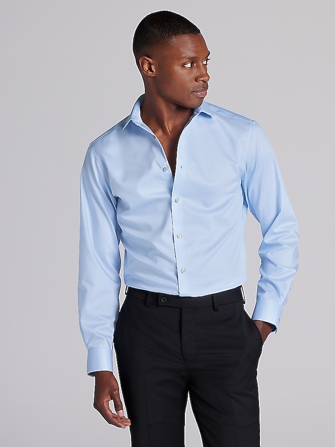
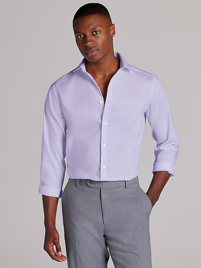
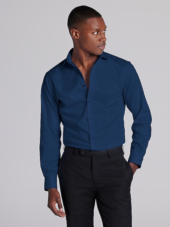
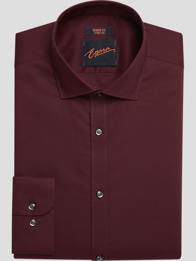
Burgundy and champagne create a wedding palette with natural depth: one shade brings richness and drama, while the other adds warmth, softness, and a subtle glow. Burgundy works especially well as a focal color in formal wedding attire, while champagne keeps the overall look from feeling too heavy or overly dark. Together, these colors suit an evening ceremony, a historic venue, a candlelit reception, or a celebration held during the cooler months, yet the palette can be adjusted for almost any setting. When choosing coordinating pieces, consider the lighting and surroundings as carefully as the color names. Burgundy may appear nearly wine-toned in a dim room and brighter red in daylight, while champagne can shift from soft beige to warm ivory depending on the fabric and nearby colors. Texture also changes the impression: a matte finish looks classic and understated, while satin, silk-inspired weaves, or subtle sheen can add a refined highlight. For a polished wedding party, classic black or navy formalwear provides a dependable foundation, allowing burgundy accents to stand out without competing with the setting. Champagne accents can soften the contrast and connect the attire to warm reception details, metallic touches, or neutral floral arrangements. If the wedding style leans more relaxed, deep burgundy can be paired with lighter tailoring and restrained accessories for a look that feels composed without appearing too rigid. Those exploring a cooler, more coastal contrast may also appreciate the ideas found in Burgundy And Blue Wedding Colors, where a rich red tone meets a crisp, dependable blue.
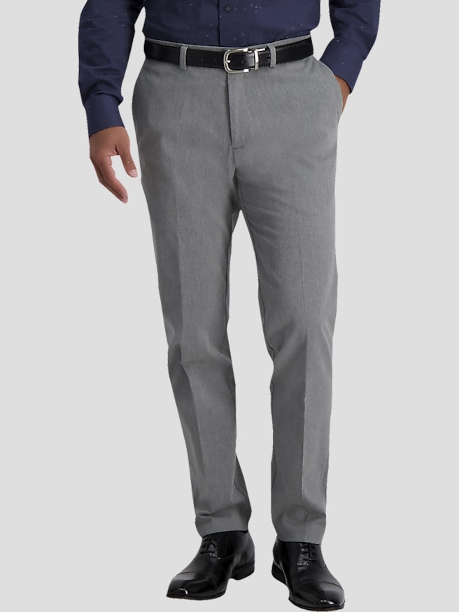
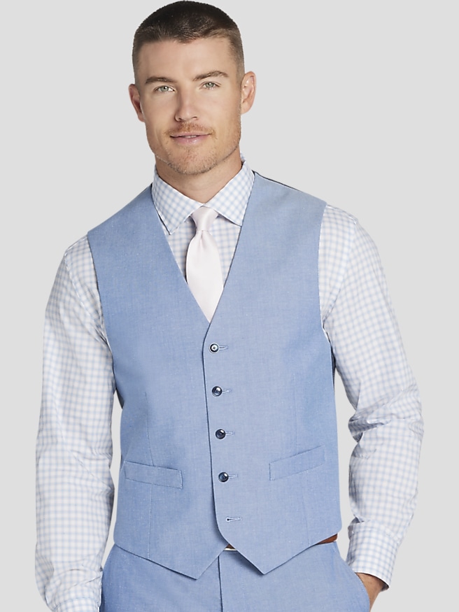
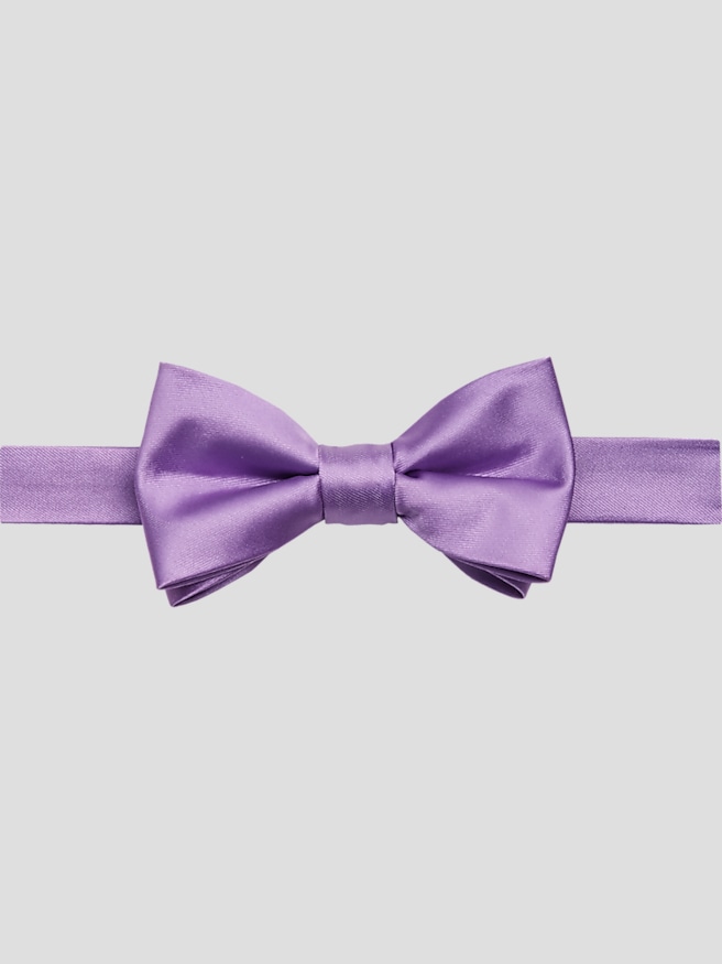
For the groom, attendants, parents, and other members of the wedding party, the most successful choices usually begin with coordination rather than exact matching. A burgundy neckwear accent can echo the deeper tones in floral arrangements, while a champagne accent can pick up warm stationery, table linens, or gold-toned décor. Pocket details, cuff accents, and other finishing touches are useful when the goal is to bring the palette into the attire without placing everyone in the same shade. Look for a consistent level of formality across the group, then allow small differences in color or texture to create dimension. A wedding party can appear more thoughtfully styled when the groom has a slightly distinct accent, the attendants share a common color family, and family members coordinate without looking as though they are wearing uniforms. Fit deserves equal attention. Shoulder seams should sit naturally, sleeves should allow comfortable movement, and trousers should fall cleanly without excessive bunching at the shoe. A well-fitted layer also photographs better, particularly during outdoor portraits when wind, uneven ground, or changing temperatures can affect posture. For celebrations that continue from a bright outdoor ceremony into a cooler evening reception, versatile pieces and comfortable fabrics help the group remain at ease throughout the day. Burgundy and champagne accessories can also make considerate gifts for members of the wedding party, fathers, close friends, or a partner. Choose items that reflect the recipient’s everyday style and that can be worn beyond the ceremony, whether with formal attire, a tailored dinner look, or a refined outfit for another special gathering. Personal touches such as a carefully selected shade, a useful accessory, or a fabric that suits the recipient’s preferences can make a wedding gift feel sincere rather than simply coordinated.
The surrounding palette offers plenty of room for customization while preserving the distinctive character of burgundy and champagne. Blush adds a gentle transition between the two main shades, sage green brings a natural note, ivory keeps the arrangement bright, and gold reinforces the warm shimmer of champagne. These supporting colors can appear in small, intentional ways through florals, printed materials, table accents, or attire details. Deep burgundy flowers paired with champagne-toned blooms and eucalyptus-inspired greenery create a layered visual effect, with dark petals drawing the eye and lighter elements providing relief. In a reception space, champagne linens or warm neutral surfaces can make burgundy centerpieces feel dramatic without overwhelming the tables. Gold-toned accents can add polish, though a restrained approach often feels more timeless than covering every detail in metallic shine. The same principle applies to stationery and signage: burgundy lettering, champagne backgrounds, ivory paper, and understated foil-like touches can introduce the wedding colors before guests arrive. When selecting attire for the group, compare shades in natural light and view them alongside the venue’s colors, floral plans, and chosen formalwear. Ordering or selecting all coordinating pieces with enough time for alterations is also important, since even a small adjustment can improve comfort and create a cleaner silhouette in photographs. As the weather moves through cooler conditions, layering and fabric weight become practical considerations, particularly for outdoor portraits or venues with open-air spaces. A palette this rich can feel intimate in an autumn-inspired setting, elegant beneath winter greenery, or warmly celebratory in a ballroom filled with soft lighting. By combining dependable tailoring, comfortable fit, measured accents, and colors that complement rather than compete, burgundy and champagne wedding attire can give the entire celebration a cohesive look that feels personal, polished, and memorable.