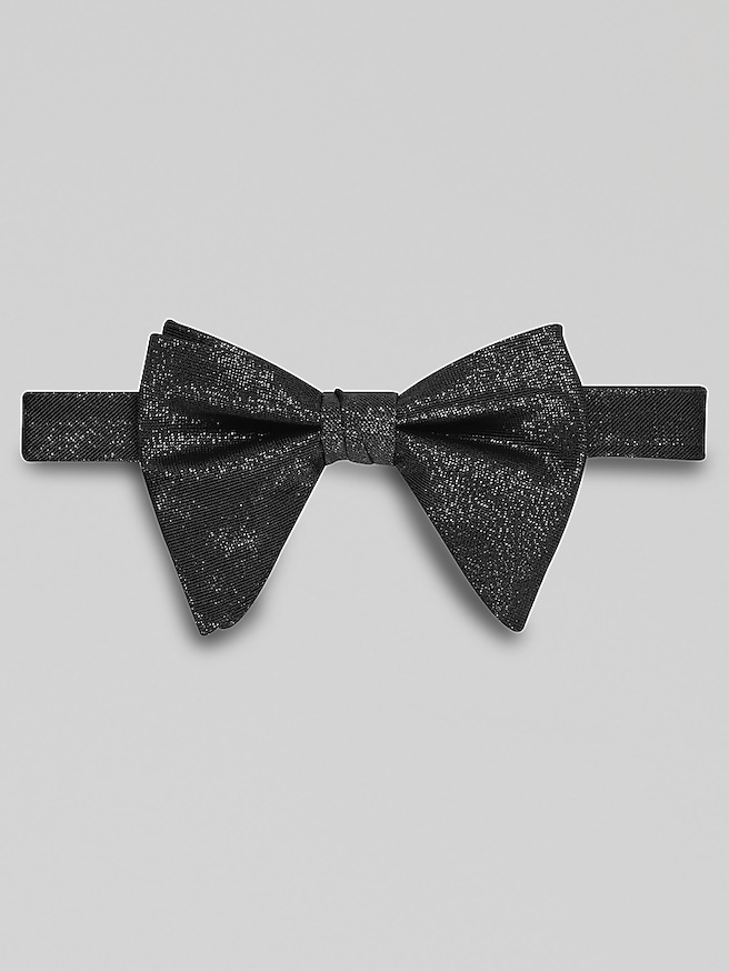
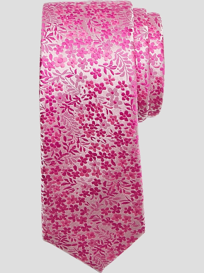
Tie colors bring definition to a suit, connect the shirt to the rest of an outfit, and give familiar tailoring a distinct personality. The right tie color depends on the occasion, the suit and shirt colors, and the amount of contrast the outfit needs—not on a fixed meaning attached to a particular shade. Navy, burgundy, and deep green create a restrained focal point, while red, pink, and brighter blues make a more noticeable statement. A navy tie against a white shirt looks crisp and composed; the same tie with a pale blue shirt feels quieter because the colors sit closer together. Burgundy adds richness to charcoal tailoring without competing with it, and a forest green tie brings depth to a navy suit. Red creates stronger visual emphasis, particularly against a light shirt, but a small pattern or a darker shade can soften that effect. These associations are visual impressions rather than universal rules about confidence, authority, or personality. For business meetings and interviews, understated colors and controlled contrast often keep the attention on the person wearing the outfit. Weddings and celebrations leave more room for blush, lavender, teal, and other expressive shades, especially when the tie echoes a detail in the event’s color palette. Brown and rust can complement tan or blue tailoring, while gray and silver offer a polished alternative when a bright accent would feel out of place. Black ties create a sharp contrast with white shirts and can suit solemn occasions or dressy evening settings, although the event’s dress code still determines the appropriate neckwear. Pale gold and champagne shades have a softer effect, with enough warmth to stand apart from a white shirt without producing a stark block of color. Across these color families, the most cohesive combinations usually give one element the leading role: a vivid tie with a quieter shirt and suit, or a subtle tie alongside more noticeable tailoring. Matching every accessory exactly is not necessary; a related accent in a pocket square can feel more natural than an identical repeat.
Fabric changes how a tie color looks, sometimes as much as the shade itself. Smooth silk can give navy a luminous finish or make burgundy appear especially rich, while textured silk breaks up reflected light for a more subdued effect. Wool ties tend to have a matte surface that lends depth to brown, olive, and charcoal. Cotton and linen bring visible texture and a less glossy appearance, making even a saturated color feel more relaxed. Polyester and blended fabrics can offer color consistency and resilience, although their feel, drape, and care requirements vary with construction. A pale silver tie with noticeable sheen looks dressier than a matte gray tie, even when the two are similar in color. Likewise, a knitted blue tie has a different character from a smooth woven blue tie, with texture adding interest without requiring a brighter shade. These differences make color, fabric, and construction useful points of comparison when exploring Tie Brands. Patterns add another layer: small dots can lighten the effect of a dark background, stripes can connect two colors already present in an outfit, and a paisley design can introduce several accents within one piece of neckwear. From a few feet away, a finely patterned tie may read almost like a solid, while a broad stripe remains a strong visual feature. Against a patterned shirt, a tie with a distinctly different pattern scale is generally easier to distinguish than one with similarly sized details. A broad, open motif can stand apart from a fine shirt stripe, for example, without making the combination feel crowded. With a checked suit, a solid or quietly textured tie gives the eye a place to settle. Color also looks different under indoor lighting than in daylight, and surrounding fabrics influence its appearance. A muted purple may seem warmer beside a cream shirt and cooler beside a bright white one. The appeal lies in the full combination, not just the color viewed on its own.
Proportion and condition help tie colors look intentional once the outfit is on. A tie’s width generally works best when it relates to the jacket’s lapels and the wearer’s overall proportions, rather than following a single measurement for every build. The tip of a necktie typically reaches the belt buckle or waistband, leaving a clean line down the shirt. A compact knot keeps a thick fabric from looking bulky, while a fuller knot can balance a wider collar opening when the fabric allows it. Smooth drape matters, too: a tie that hangs flat shows its color and pattern more clearly than one twisted by an overly tight knot. Neckties and bow ties can share a color palette while serving different dress expectations; for an event specifying black tie, the conventional choice is a black bow tie with a tuxedo, not simply a black necktie with any dark suit. For everyday business wear, presentations, dinners, graduations, and wedding celebrations, the range of appropriate colors is much broader. That versatility also makes neckwear a thoughtful gift for a graduate, a partner, a parent, or someone building a professional wardrobe. Familiar suit colors and personal preferences provide better clues than assumptions about what a shade is supposed to symbolize. Someone who wears navy tailoring often may appreciate burgundy or green, while someone drawn to tonal outfits may prefer blue in a different depth or texture. Care helps preserve those distinctions. Following the fabric’s care label, loosening the knot completely after wear, and storing ties without sharp folds can protect their shape. Blotting a spill instead of rubbing it helps avoid spreading the mark or roughening the surface; delicate fabrics may require professional cleaning. Ties should also be kept away from rough edges that can snag the weave. Good construction and careful handling support lasting wear, allowing a well-chosen color to remain a dependable part of an outfit rather than a detail reserved for a single occasion.